
Tailwind CSS: Beyond Traditional CSS – Advantages, Use Cases, and Implementation Guide
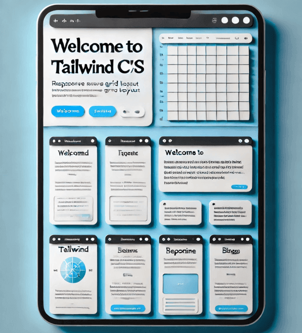
Tailwind CSS has revolutionized the way developers create and customize their web interfaces since its launch in 2017 by Adam Wathan and Steve Schoger. This "utility-first" CSS framework provides utility classes that allow detailed customization and great flexibility without the limitations of predefined components. Throughout this presentation, we will explore the history, advantages, and practical applications of Tailwind CSS, showing how its adoption can significantly transform web development by offering powerful and adaptable tools to build any design efficiently and consistently.
History and Philosophy of Tailwind CSS
Tailwind CSS was created by Adam Wathan and Steve Schoger in 2017. The idea arose from the need for a CSS framework that allowed greater flexibility and customization without the limitations imposed by predefined components. The philosophy behind Tailwind is "utility-first," that is, providing utility classes that do one thing and do it well, allowing you to build any design efficiently and consistently.
Advantages of Using Tailwind CSS
1. Highly Customizable
Tailwind CSS is very flexible and can be easily adjusted to the specific needs of your project. You can customize colors, styles, spacing, and themes through the tailwind.config.js file. This allows you to adapt the framework to any design you want, facilitating management and improving client satisfaction.
2. Common Utility Patterns
Tailwind CSS removes the complexity of naming and organizing classes. It uses common utility patterns that simplify the creation of custom components without the need to write much CSS code. You can extract values directly from the configuration files using the theme() function.
3. Optimization with PurgeCSS
A great advantage of Tailwind CSS is that it can be optimized using PurgeCSS, a tool that reduces the CSS file size by removing unused classes. This is especially useful to keep the file size small as your project grows, improving site performance.
4. Complex Responsive Designs
Tailwind CSS adopts a mobile-first approach, making it easy to create responsive designs. It uses utility classes across different breakpoints to build complex layouts that adapt effortlessly to any screen size.
5. Active Community and Support
The Tailwind CSS community is very active and offers a lot of support. If you encounter any issues, you can quickly get help from other users or the Tailwind team. This allows you to solve problems efficiently and continue developing your project without interruptions.
How to Get Started with Tailwind CSS
This project was successfully completed in Visual Studio Code
Step 1: Project Structure
First, make sure your project has a basic structure like this:
Step 2: Installing Tailwind CSS
Make sure you have installed Tailwind CSS and its dependencies correctly. Run the following commands at the root of your project:
Step 3: Tailwind CSS Configuration
Configure Tailwind in your tailwind.config.js file to scan your HTML and JavaScript files:
Step 4: PostCSS Configuration
Here you should create a postcss.config.js file at the root of your project:
This file configures PostCSS to use Tailwind CSS and Autoprefixer. If you don't have these dependencies installed, make sure to install them with the following command:
Once you have created this file and have the dependencies installed, your PostCSS configuration should be ready to work with Tailwind CSS.
Step 5: Create the CSS Input File
Create a src/input.css file and add the Tailwind directives:
Step 6: Create the HTML File
Make sure you have an index.html file at the root of your project with the following content:
Step 7: Compile Tailwind CSS
Run the following command to compile your input CSS into the output file:
This command will compile your input.css file and generate the output.css file in the dist folder. The --watch flag will ensure that any changes in your files are automatically reflected in the output file.
Portfolio Project with Tailwind CSS
This portfolio not only demonstrates technical competence but also the ability to design attractive and functional interfaces with Tailwind CSS.
The main goal of this portfolio is to provide a platform where projects, skills, and work experiences can be showcased. This allows highlighting the profile to potential employers and clients, facilitating access to jobs and achievements. It has been created using both real and fictitious data to make it more interactive.
Project repository: https://github.com/karlacabanas01/my-portfolio
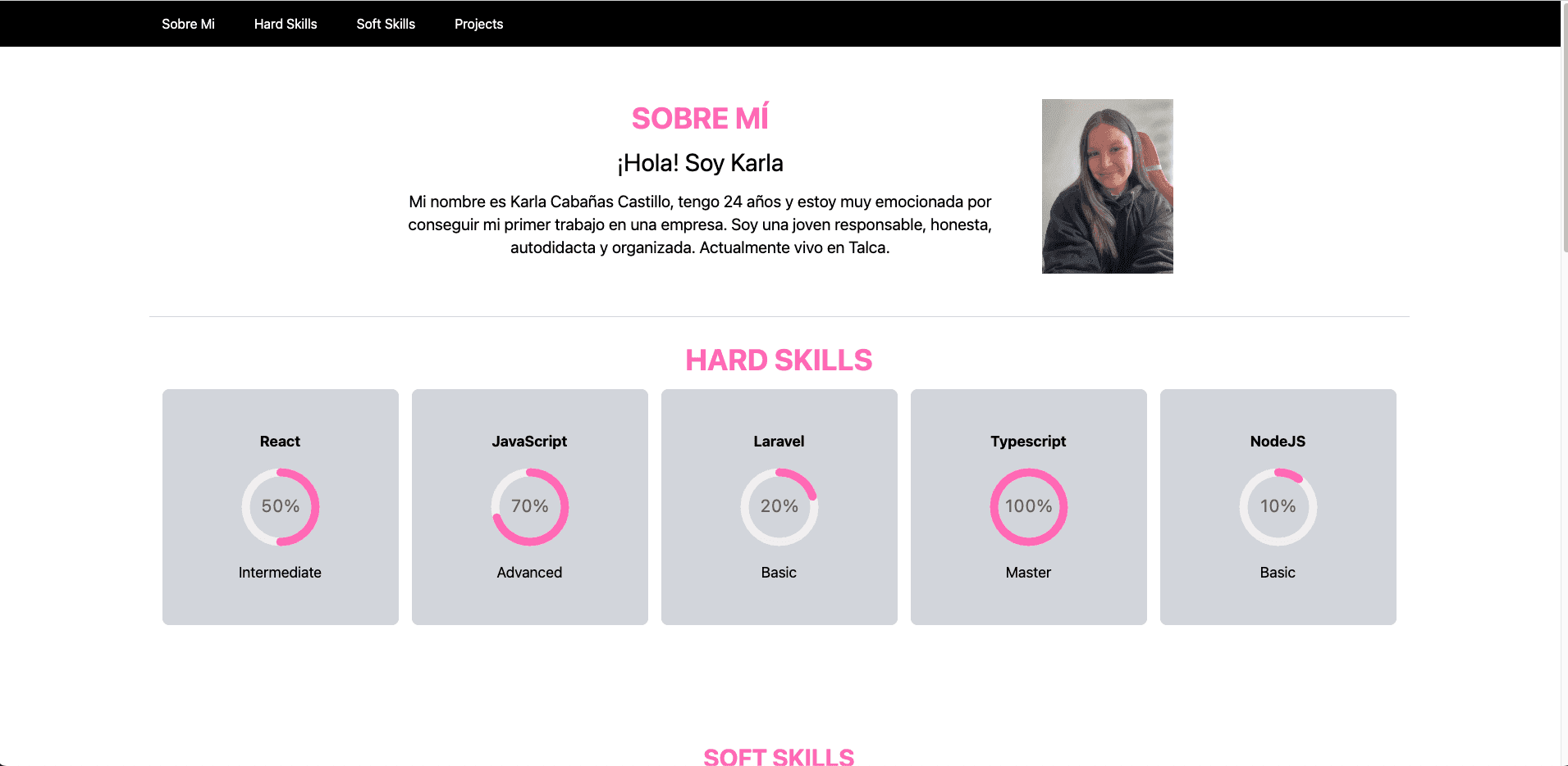
Part of the Code Explained
Below is an explanation of part of the portfolio code; this code creates a React component called SoftSkills, which displays a list of soft skills with images, using Tailwind CSS for styling.
Tailwind styles used in the code:
- Centered text and large top margin (
className="text-center mt-36"). - Large text, bold, bottom margin, and custom color (
className="text-3xl font-bold mb-4 text-custom-pink"). - Row and column layout, centered, and spacing between items (
className="flex flex-wrap justify-center gap-8"). - Cards with border, shadow, white background, and scale effect on hover (
className="flex flex-col items-center w-1/4 p-4 border border-gray-300 shadow-lg rounded-lg bg-white transition transform hover:scale-105"). - Fixed size, bottom margin, and rounded borders (
className="w-50 h-40 mb-4 rounded-full"). - Large and bold text (
className="text-xl font-bold").
Common Use Cases
Responsive Design
Tailwind makes it easy to create responsive layouts with specific classes for different screen sizes. For example:
Theme Customization
Tailwind allows you to define and extend custom themes in its configuration file. This is especially useful to maintain a consistent color palette and styles throughout the project:
Dark Mode
Tailwind makes it easy to implement dark mode in your project. You just need to configure darkMode in your configuration file:
And then use the dark: classes for dark mode styles:
Animations
Tailwind also includes utilities for basic animations and transitions. You can extend these utilities in the configuration file:
And apply them to your elements:
Spacing and Alignment
Tailwind provides classes to manage internal padding and external margin of elements.
Typography
Tailwind CSS includes classes to handle typography, allowing you to adjust text size, weight, and style.
Backgrounds and Borders
You can use Tailwind classes to easily define background colors and border styles.
Interaction States
Tailwind CSS includes classes to handle interaction states like hover, focus, and active.
Tailwind Plugins
Tailwind CSS has an active community and a wide range of plugins that extend its functionalities. Some popular plugins include:
- @tailwindcss/forms: For styling forms.
- @tailwindcss/typography: To enhance typography in articles and blogs.
- @tailwindcss/aspect-ratio: To maintain consistent aspect ratios in elements.
To install a plugin, simply use npm:
And add it to your configuration file:
Tools and Ecosystem
Tailwind CLI
Tailwind provides a CLI that allows you to compile and optimize your styles easily. You can use the CLI to generate your final CSS file:
Intellisense
To improve the development experience, you can install the Tailwind IntelliSense extension in VSCode, which provides autocomplete and suggestions for utility classes.
JIT (Just-In-Time Compiler)
Tailwind CSS includes a JIT compiler that generates CSS classes on demand as you use them in your HTML. This improves performance and reduces the final CSS file size:
Framework Compatibility
Tailwind CSS integrates easily with various JavaScript frameworks and other development tools, including:
- React: Tailwind can be used directly in React components to style applications.
- Vue: There are specific plugins and configurations to use Tailwind with Vue.
- Next.js: Tailwind can be configured in Next.js projects for development and production.
Tailwind CSS has established itself as an essential tool in the modern developer's toolkit due to its flexibility, customization, and efficiency. From its "utility-first" philosophy to its advanced optimization and responsive design capabilities, Tailwind CSS offers a robust approach to creating attractive and functional web interfaces. The active community and ecosystem of tools and plugins around Tailwind ensure continuous support and enriching resources for developers. By implementing Tailwind CSS in web projects, you achieve not only improved development efficiency but also enhanced quality and customization of final products, facilitating the creation of exceptional user experiences.
Additional Resources
Ready to transform your web projects with Tailwind CSS?
At Kranio, we have frontend development experts who will help you implement efficient solutions using Tailwind CSS, ensuring your interfaces are modern, responsive, and highly customizable. Contact us and discover how we can boost the efficiency and quality of your web developments.
Previous Posts

AI Prompt Injection: How to Secure Your Infrastructure
Discover what Prompt Injection in AI is, how the latest attacks work, and what strategies to implement to protect agents, copilots, and LLM-based systems.

RabbitMQ (the king of queues) or Apache Kafka (the event streaming giant)?
Learn the differences between RabbitMQ and Apache Kafka, their use cases, and the 2026 updates to choose the best messaging solution for your architecture.